
Most marketers are familiar with the potential of using banner ads to increase brand awareness and boost website traffic. Few, however, have the design or copywriting experience to create a web banner that generates as many clicks as possible. Today, we’ve got a list of ingredients that will help make your next ad your best one yet.
What Goes into a High-Converting Banner Ad?
1. Use Standard Sizing
There’s plenty of room for experimentation in advertising and marketing, but when it comes to the size dimensions of digital advertisements, just play it safe. Google AdSense recommends using the following sizes, depending on where you plan on placing your ad:
- 300×250: Useful within or at the end of text-based content
- 336×280: Ideally placed within or at the end of text-based content
- 728×90: Great for placement above large pieces of content, like long articles or forum sites
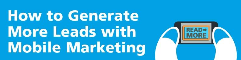
- 300×600: One of the top ad sizes for generating impressions
- 320×10: Perfect for visually-engaging mobile ads
These ad sizes perform the best because of their optimal fit within the spaces they occupy. In other words, they have a higher tendency to catch the eye of your audience.
2. Write Actionable Copy
Leo Burnett, world famous advertising executive, once said, “We want consumers to say, ‘That’s a hell of a product’ instead of, ‘That’s a hell of an ad.’” Remember, you’re not selling your ad, you’re selling your product or service.
It’s fun to come up with clever puns and elaborate taglines, but is that necessarily what your ideal customers want? Especially when it comes to banner ads, their attention is likely focused elsewhere on the webpage, and they don’t want to analyze several layers of irony within your ad copy to figure out the underlying message. They want to know the value of your ad immediately. Tell your audience what your ad does for them.
Actionable and urgent copy tends to perform best. Use words like:
- Free
- Offer
- Easy
- Value
- Proven
- Bargain
These are just a few words that can help translate the significance of your ad, and tell people why they should click it.

3. Visual Hierarchy
Maintaining the right visual hierarchy within your banner is necessary for effective communication. Theories of visual hierarchy get a bit complicated, so we’ll keep this simple: people’s eyes will naturally focus on the largest piece of text on your ad first.
Providing ample space between blocks of text also improves readability. The denser the text, the harder it is to decipher, and the more likely it is that your ad will be ignored.
4. Color Schemes
While certain colors are more vibrant and attention-demanding than others, it’s poor marketing to develop an ad that doesn’t reflect your brand. For example, the main color associated with our brand, Fat Guy Media, is green. A red and white ad wouldn’t echo our brand.
It’s certainly recommended to harp on the psychological effects of color theory, but make sure your ad is still on-brand. If it’s not, it will be far less effective in terms of breeding brand awareness.

5. Use a Button
The end goal of any banner ad is to get people to convert on some sort of offer, whether it’s the sale of a product or the entry of their contact information for further lead nurturing. So give them some guidance!
A textured button that combines the actionable copywriting and visual hierarchy tips listed in this blog will inspire your audience to act on your offer.
Banner ad creation isn’t a simple process, but these tips will steer you in the right direction. Once you’ve created a successful ad, consider A/B testing it to figure out which elements can be improved even further.