
Google+ Cover Photo & Profile Picture
It is always a bit of a surprise when you come into work and see unexpected changes to anything. A couple of weeks ago it was the rolling out of Custom Vanity URLs for Google+ Users. Well, today we came in to find that Google+ changed the whole layout of user profile pages, specifically the placement of the user’s cover photo and profile picture.
Goodbye Incredibly Large Google+ Cover Photo
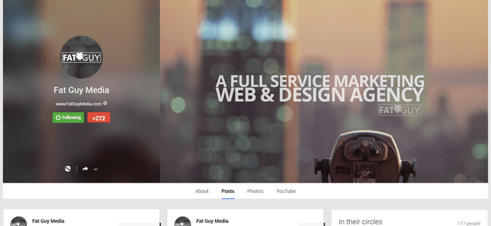
Part of this new layout eliminated the insanely large cover photo, whose dimensions were 2120x1192px. I always felt from the start that the cover photo was too big, plus they always seemed to be blurry, regardless of the size of the photo you uploaded. Now the new cover photo dimensions are 927x523px; they have finally brought the cover photo size to manageable dimensions! Keep in mind that the design is responsive, and the new dimensions listed above were taken from 24” monitors. If you are unsure of how to create your cover photo graphic, just remember to follow a 16:9 image ratio. Another great perk of the new cover photo is that you see the entire cover photo from the start—you no longer have to suffer through half of your cover photo being cut off! 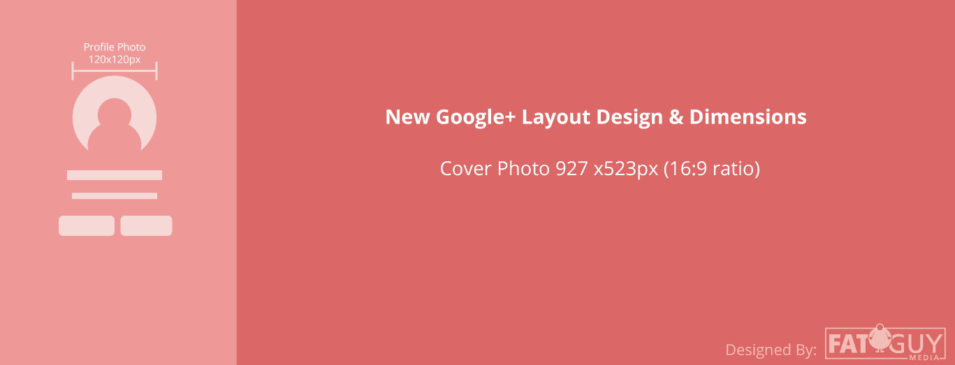
Overall Layout Redesign
Now that Google+ has updated the size of the cover photo, they repositioned it a bit, in addition to your profile picture and the information that used to go beside it as well. Your profile picture and information are now stacked and positioned on the left side of your cover photo; your profile picture is on top (120x120px), and your general information is beneath it. This information is displayed on a frosted-looking overlay that blurs out the background image behind it. The image that they use for the blurry background behind your personal information is actually a clip of your cover photo that Google has randomly selected. With all that said, I’m still up in the air a little bit as to whether I love it or hate it. However, I will definitely say that it is better than that old, monstrous-looking cover photo. Plus, now you can really gear your cover photo to present an incredible message, without the worries of it being cut off. Let us know what you think of the new Google+ Cover Photo and Profile Picture Layout on Twitter, Facebook, or Google+!